1984
January 13, 2021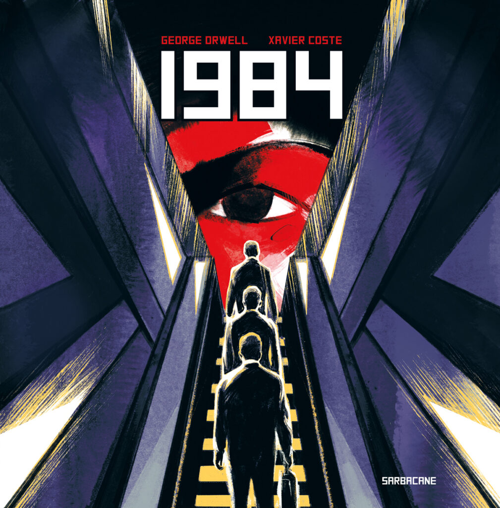
Author: George Orwell
Adaptation: Xavier Coste
Publisher: right now, it’s only available in french but as Coste’s other jobs are available in english, it’s only a matter of time before this one gets translated.
(All my apologies if some terms are different from those used in the english novel. I tried to check them on Wikipedia but some mistakes might have slipped.)
Winston Smith works at the Ministry of Truth. His job is editing previously published articles so they’ll check with what Big Brother’s party conveys as information to citizens. Those are sometimes very slight alterations, sometimes exhausting work that requires speed of execution because a citizen should not come across a document that contradicts what the Party is saying.
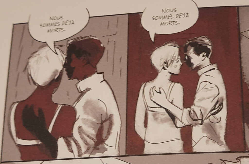
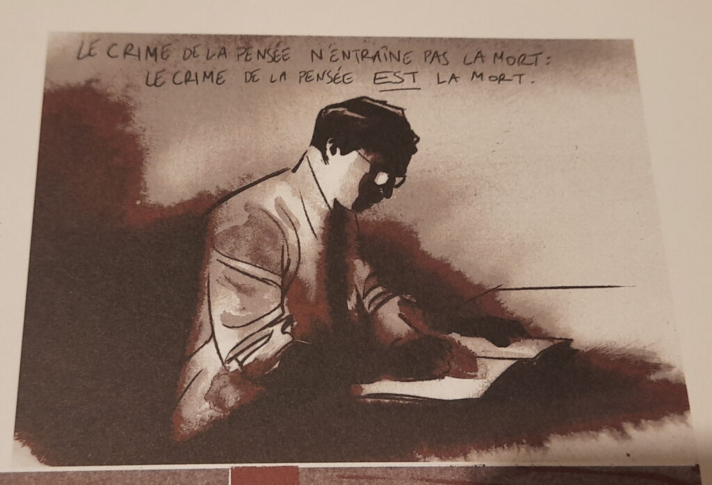
Winston is not naive and understand pretty well the system he is a part of. He knows the rules, how they work, as well as the risks involved in breaking them. Like writing his memoirs in a notebook, which is a “thought crime.” Still, Smith rushes into it and sinks into a no-win situation.
Like many people, I had heard of 1984 as an essential work depicting a totalitarian state. There was the Apple ad that referred to it (back in the days when Apple wasn’t Big Brother – after reading the book, this ad is even more edifying now) but I had never read it. With the passage of Orwell’s works into the public domain, their adaptations flourish. In France, we have or will have 3 comic book adaptations which have only been published in 3 months. Covid effect and publication planning turned upside down ? Unfortunate coincidence of ideas arriving at the same time ? Only small mice in publishers’ walls could find the truth.
So I had in my hands Xavier Coste’s adaptation (thanks to my local comic-store, La Cour des miracles !) Coste will sign his book at the end of january, so reading the book beforehand is, for me, mandatory. 🙂
If you are like me, then you probably have a general idea of the story without knowing its course or conclusion. Without spoiling anything, 1984 is an novel published in 1949 of deep and immense darkness.
If you’re depressed, don’t dive into this, there isn’t much to put you in a good mood. The questions Orwell asks, the conclusion he chooses, are all the more disturbing.
If we can see the novel as a critique of the communist system, the relevance of this comparison has an inverse value to its evidence. Actually, it is very easy to transpose the world of 1984 to ours. Of course, we can only experiece (fortunately) a tiny grasp of what Big Brother is, but when you read this book, you realize that we are never far from a global nightmare. It remains to be seen what keep us from completely switching to a Big Brother system. Maybe this is the activism of some people ? Perhaps it is the fact that power is in a lot of different hands ? Maybe even the business competition (and therefore capitalism) is saving us ?
Orwell never places his hero above his human condition and the story, cut into two large parts (in this book), makes us feel it. There is always a way to break an individual, however solid his/her integrity may be.
Difficult of course to judge the adaptation’s quality since I haven’t read the original novel. That said, I find Xavier Coste’s graphic design interesting and logical, especially compared to the other adaptations available.

Here, the art isn’t cartoony, we are face to face with a realistic line which brings the story closer to our daily life. The shadowy atmosphere recalls sci-fi visuals like Brazil (no shit, Sherlock ! 😉 ) or Blade Runner. While it doesn’t constantly rain like in Scott’s movie, I never felt like there was any sun in Coste’s book. Which one can understand as he sees how Coste manages his colors.
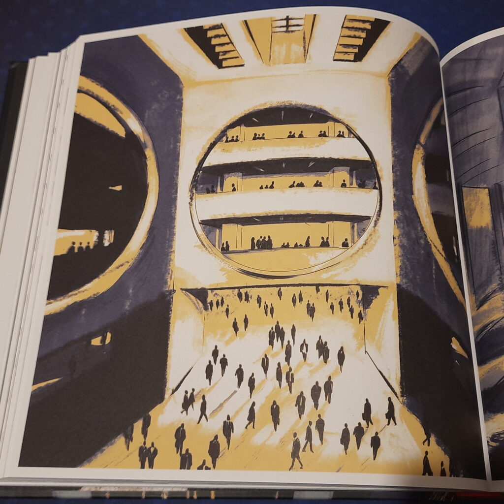
First of all, there isn’t much time reference. During the day, all the workers are in open spaces without any window. All there is is corridors, offices, artificial light and the omnipresence of telescreens, monitors broadcasting Party propaganda and monitoring spectators. To translate this, Coste will use quasi-monochrome tones: ocher, gray and yellow are the most present colors and will rarely meet on a same page.
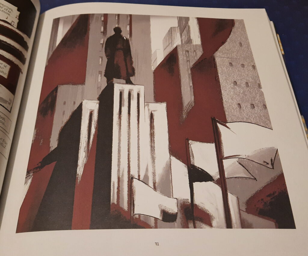
I really liked the use of constructivist architecture and posters. This refers of course to both Nazism and Stalinism, two opposing extremes which get along well when it comes to control and communication. Coste succeeds in giving his world an oppressive side while being visually dazzling. The lines are pure, efficient, readable, the beauty of geometry applied to human life. Including a completely desired coldness.
In the end, I really liked this adaptation. I am curious about the choices the artist had to make, what he had to put aside and the heartbreaks caused by theses choices (since this project has been close to his heart for a long time). As I wrote earlier, he’s on a signing tour for his comic-book so I’ll probably have the opportunity to ask him the question.